
| Background | Select the background color. |
| Background gradient | Select gradient for the background color. |
| Alternate background | Select an alternate background color. |
| Card background | Select the card background color. |
| Edge background | Select the edges background color. |
| Border | Select color for the border. |
| Content | Heading Select color for the heading text. Text Select color for the text. Link Select color for the links. Highlight text Select color for the highlighted text. Highlight background Select color for the highlighted text background. |
| Primary button | Background Select the button background color. Text Select the button text color. Border Select the button border's color. Hover background Select the button's background color on hover. Hover text Select the button's text color on hover. Hover border Select the button's border color on hover. |
| Secondary button | Background Select the button background color. Text Select the button text color. Border Select the button border's color. Hover background Select the button's background color on hover. Hover text Select the button's text color on hover. Hover border Select the button's border color on hover. |
| Image | Background Select the image's background color. Overlay background Select the image's overlay background color. Overlay heading Select the image's overlay heading color. Overlay text Select the image's overlay text color. (Note: The image overlay colors work for the images, which are mandatory for the sections.) |
| Product card | Background Select the card's background color. Border Select the product's border color. |
| Slider arrows/dots | Background Select the slider arrow's background color. Color Select the slider arrow's text color. Border Select the slider arrow's border color. |
| Forms | Text Select the input field's text color. Background Select the input field's background color. Border Select the input field's border color. |
| Sale badge text | Select any text color for sale badges. |
| Sale background | Select any background color for sale badges. |
| Preorder badge text | Select any text color for preorder badges. |
| Preorder background | Select any background color for preorder badges. |
| Sold out text | Select any text color for sold out badges. |
| Sold out background | Select any background color for sold out badges. |
| Custom badge text | Select any text color for custom badges. |
| Custom badge background | Select any background color for custom badges. |
| Discount text | Select any text color for discount badges. |
| Discount background | Select any background color for discount badges. |
| Success text | Select any text color for success text. |
| Error text | Select any text color for error text. |
| Warning text | Select any text color for warning text. |
| Background | Select the header's background color. |
| Text | Select the header's text color. |
| Hover text | Select the header's text color on hover. |
| Border | Select the header's border color. |
| Icon color | Select the header's icons color. |
| Quick access menus | Text Select the Quick access menu button's text color. Background Select the Quick access menu button's background color. |
| Image | Background Select the image background color. Overlay background Select the overlay's background color. Overlay heading Select the overlay's heading color. |
| Desktop submenus | Background Select the sub menu's background color. Text Select the sub menu's text color. Hover text Select the sub menu's text color on hover. Border Select the sub menu's border color. |
| Mobile menus/submenu | Color scheme Select any color scheme defined in the theme settings>Colors>Schemes. |
| Background | Select any color for the footer background. |
| Edges | Select any color for the footer edges. |
| Heading | Select any color for the footer heading. |
| Text | Select any color for the footer text. |
| Link | Select any color for the footer links. |
| Link hover | Select any color for the footer links hover. |
| Forms | Text Select the form's text color. Border Select the sub menu's border color. |
| Button | Text Select the button text color. Background Select the button's background color. |
| Headings | Font Select the font of the heading text. Adjust the line height for headings used in all sections. Adjust the range bar to set the font size scale. | |
| Body | Font Select the font of the body text. Adjust the line height for headings used in all sections. Adjust the range bar to set the font size scale. | |
| Accents | Font Select the font of the accents text. Adjust the line height for headings used in all sections. Adjust the range bar to set the font size scale. |
| Container | Choose the container width from the following options: - Small - Regular - Medium - Edges gap |
| Styling | Card radius Adjust the range bar to select the border radius of cards. |
| Form inputs | Height Choose the form field's height from the following options: - Small - Medium - Large Form radius Adjust the range bar to select the border radius of page forms. |
| Animations | Enable heading animations Select this checkbox to enable the animation on headings. Heading animation style Choose the animation styles from the following options: - Curve rise - Falling curve - Flash flick - Reveal - Scatter fly - Slide up - Wave slide up Enable card animations Select this checkbox to enable the animation on cards. |
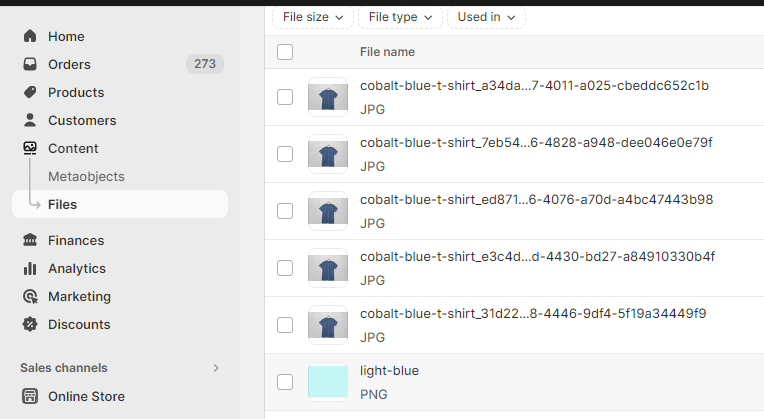
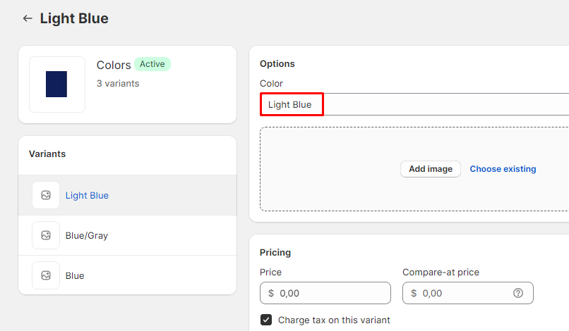
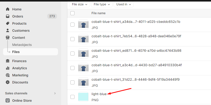
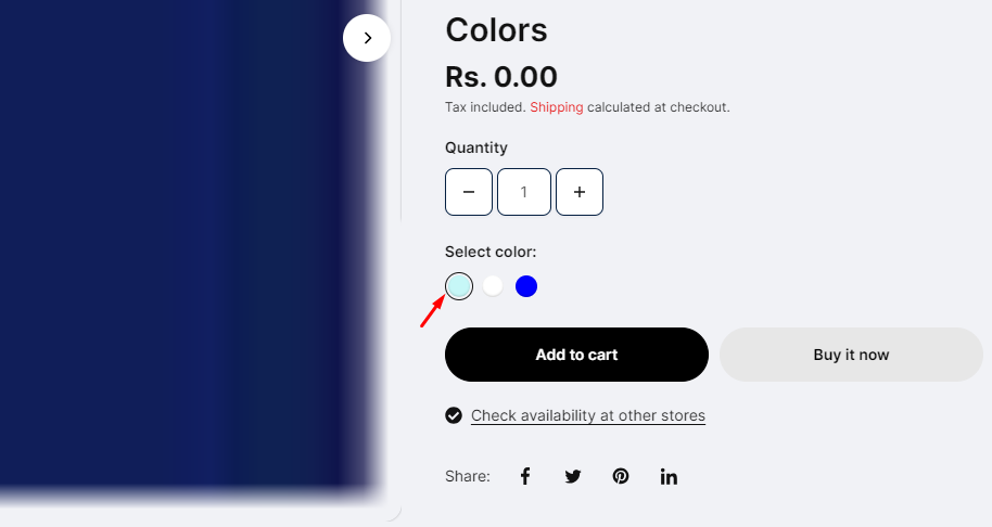
| Variant style | Choose the variant style from the following options: - Variant image - Color swatch |
| Color options name | Enter the option name that holds the colors. E.g., Color, Colour, etc. |
| Custom color codes | Add color codes for the options as per the following details: The left-side options will be the names of the categories that hold the colors (e.g., Color, Material), while the right-side values will be the corresponding color codes, separated by an equals sign. For example, if the variant name is "plaid" under the "Color" category, the color code should be entered as "plaid:#ccc." (Please note that the color option names are case-sensitive.) |
| Color swatch type | Choose the color swatch type from the following options: - Square - Circle |
| Size options trigger | Enter the option name that holds the size option. E.g.: Size,Taille, etc. |
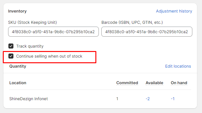
| Enable preorder | Select this checkbox to show Preorder button instead of the Add to cart button on products, where ' Continue selling when out of stock ' is checked. |
| Card style | Choose the card style from the following options: - None - Border only - Background only - Border with background |
| Show vendor | Select the checkbox to show the product vendor name. |
| Show price | Select the checkbox to show the product price in the grids. |
| Saving price options | Select from the options to determine the saving price options: - None - Amount off - Percentage off |
| Grid hover style | Choose the style from below options: - Product options - Second image - Size options only |
| Quick view visibility | Choose the quick view visibility from below options: - Always - On hover - None |
| Card radius | Adjust the range bar to determine the card's radius. |
| Card gap | Adjust the range bar to determine the card's gap in the grids. |
| Font size | Choose the font size from the following options: - X-small - Small - Normal - Medium - Large - X-large |
| Sale badge | Show 'Sale' badge Select this checkbox to show the 'Sale' badge based on the conditions selected below. Note: The sale badge shows on the products where the compare price is defined from the Shopify product side. |
| Sold out badge | Show ' Sold out ' badge Select this checkbox to show the ' Sold out ' badge. |
| Show preorder badge | Select this checkbox to show the preorder badges on the product grids. This preorder shows for the products whose ' Continue selling out of stock' is checked from the admin product side.  |
| Custom badge | Product tags Add custom labels in the product tags and then type those in this field. The tags will start showing on the storefront. Custom badge text Type the badge text to display. |
| Style | Choose the search style from the following options: - Page - Drawer |
| Show popular categories | Select this checkbox to show the most popular categories. |
| Heading | Add text to the heading in the search drawer. E.g., Suggestions. |
| Popular categories | Add any labels to show in the suggestions as pre-defined. Use comma-separated values for multiple queries. |
| Suggestions | Popular products Visibility Choose the popular products visibility from the following options: - Before search - After search, no results - Both - None Heading Add text to the heading. Products Choose the products. Popular collections Visibility Choose the popular collections visibility from the following options: - Before search - After search, no results - Both - None Heading Add text to the heading. Collections Choose the collections. |
| Search results | Search behavior Choose the search behavior from the following options: - Products only - Products and pages - Products and articles - Products, articles and pages - All content Products image ratio Choose from image's ratio from the following options: - Auto - Square - Landscape - Portrait Collections image ratio Choose from image's ratio from the following options: - Auto - Square - Landscape - Portrait Color scheme Select any color scheme defined in the theme settings>Colors>Schemes. |
| Button style | Choose the button style from the following options: - Normal - Animated |
| Font | Choose the font from the following options: - Accent - Body - Heading |
| Radius | Adjust the range bar to determine the button radius. |
| Color scheme | Select any color scheme defined in the theme settings>Colors>Schemes. |
| Overlay background | Choose any color for the overlay background. |
| Overlay opacity | Adjust the range bar to determine the overlay opacity. |
| Style | Choose the cart style from the following options: Drawer or Page. |
| Gift wrap | Enable gift wrap Tick this checkbox to show the gift wrap in the cart drawer. Product Select any product to include in the gift wrap. Text Type any text to show with the gift wrapping checkbox. |
| Shipping bar | (Note: This feature only works with a shipping method. If you're using multiple shipping methods, it might show false values to the customer.) (Note: Users must write a number, no letters or special characters.) (Note: Use ||amount|| to display the amount within the message.) |
| Cart drawer | Show cart notes Select this checkbox to show the cart notes in the cart drawer. Show estimate shipping Select this checkbox to show estimate shipping in the cart drawer. Enable payment icons Select this checkbox to show the payment icons in the cart drawer. Cart recommendations Show in Choose the options to show the recommendations in: - Drawer - None Heading Enter the heading text. Products Choose the products list. Empty cart recommendations Heading Enter the heading text. Collection list Choose the collections list. Color scheme Select any color scheme defined in the theme settings>Colors>Schemes. |
| Heading | Enter the heading text. |
| Enable country/region selector | Select this checkbox to show the country/region selector. |
| Enable language selector | Select this checkbox to show the language selector. |
| Sharing options | These options are useful to share the product, articles on the social networking sites. Share on Facebook Select this checkbox to share on Facebook. Tweet on X (formerly Twitter) Select this checkbox to share on X (formerly Twitter). Pin on Pinterest Select this checkbox to share on Pinterest. Share on Telegram Select this checkbox to share on Telegram. Share on Email Select this checkbox to share on Email. |
| Social accounts | These options are to show the merchant's social networking pages. Enter the Facebook account link. Enter the Instagram account link. YouTube Enter the YouTube account link. TikTok Enter the TikTok account link. X (formerly Twitter) Enter the Twitter account link. Snapchat Enter the Snapchat account link. Enter the Pinterest account link. Tumblr Enter the Tumblr account link. Vimeo Enter the Vimeo account link. |
| Enable | Select this checkbox to enable the scroll to top icon. |
| SVG code | Add the SVG icon code. |
| Horizontal position | Choose the icon position from the following options: - Left - Center - Right |
| Vertical position | Adjust the range bar to determine the vertical position of this icon. |
| Colors | Background Choose any color for the icon background. Icon Choose any color for the icon. Border Choose any color for the border. |