✨Template product
This section is to maintain the settings of the product page on your store.
Last updated
This section is to maintain the settings of the product page on your store.
Last updated
Go to Customize theme. Select the Products > Default product template on the top dropdown menu.
From the left side menu, select “Main Product.”
Customize the section by utilizing the settings on the right side of the theme editor, as described below:
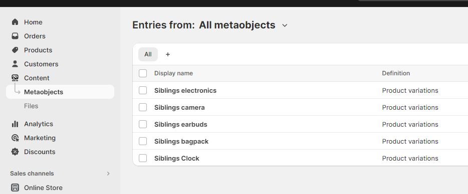
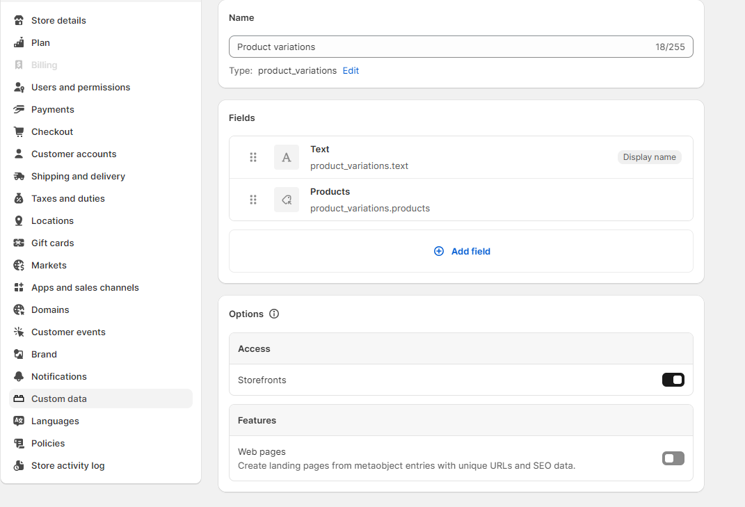
Starlite includes the ability to link directly to other products as product swatches. The result is rich product detail pages that include swatches with images that represent each variant option. This feature is called product variations. When you view a variation product, only the images associated with that variant option, plus product details, and prices for the variant are shown. Follow the steps below to complete the setup: 1. Add a metaobject with two fields: Text and Product list.
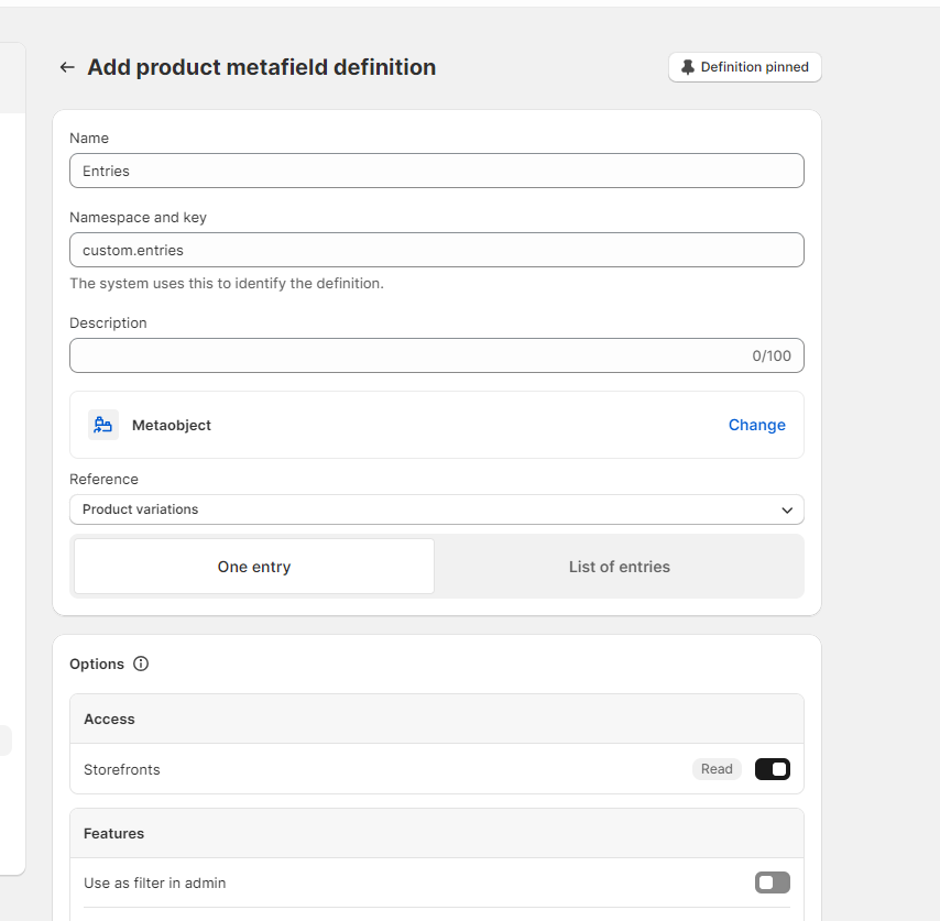
Go to the product metafield and add a new one with field: Metaobject and select the above created one, as shown below:
Now create entries and select related products.
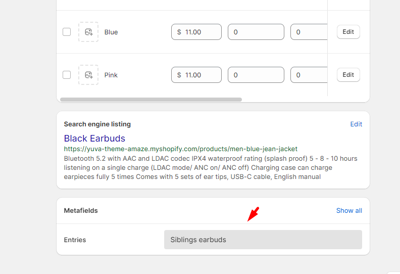
Go to specific products and link the entries.
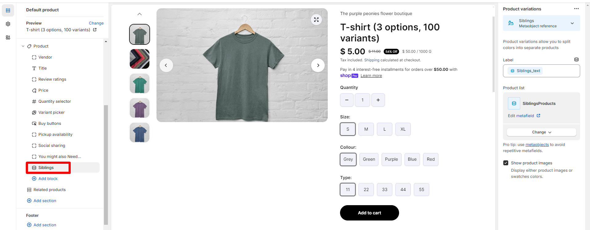
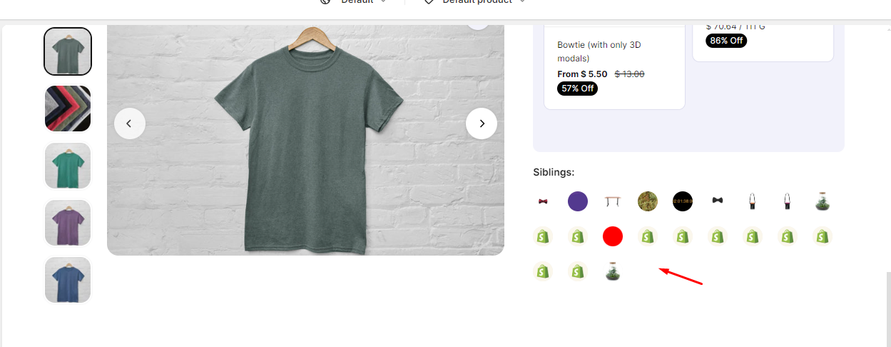
Go to the theme editor and add the Product variations block and attach the recently created metaobject, as shown below:
This will start looking like this:
Main product
Desktop layout Choose the product gallery layout from the following options: - Carousel with card overlap - Carousel - carousel with sticky options Media ratio Select the media ratio from the given options:
-Auto
-Landscape
-Portrait
-Square
Colors
Color scheme
Select the color scheme.
Note: These can be managed from Theme settings> color schemes.
Section spacing
Desktop top space
Adjust the range bar to add spacing at the top of the section for desktop view.
Desktop bottom space
Adjust the range bar to add spacing at the bottom of the section for desktop view.
Mobile top space
Adjust the range bar to add spacing at the top of the section for mobile view.
Mobile bottom space Adjust the range bar to add spacing at the bottom of the section for mobile view.
Title
This block shows the product title. Title size Select the title size from the following options: - XX- large - X- large - Large - Medium - Small - X-small
SKU
This block showcases the product SKU value.
Price
This block showcases the product price. Hide shipping content Select this checkbox to hide the shipping content from the price block.
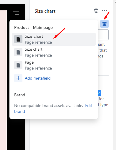
Size chart
Social sharing
This block is to share the product on social media sites: Facebook Instagram Twitter Linkedin Pinterest
Variant picker
This block showcases the variants list. Select from the following options to determine the variant picker type: -Dropdown -Button
Quantity selector
This block displays the quantity selector i.e. used to select the product quantity while making a purchase.
Inventory status bar
Show in product sticky form Select this checkbox to show this block in the sticky form. Show status Select this checkbox to show the inventory status. (Note: For low inventory threshold setup, go to theme settings>product inventory.)
Pickup availability
This block displays pickup availability of the product.
Buy buttons
This block shows the add to cart button. Show dynamic checkout button Select/deselect the checkbox to show the dynamic checkout button. Show recipient information form for gift card products Check this checkbox to show the gift card form on the gift card products. Gift card products can be sent directly to a recipient with a personal message by using this form.
Complementary Products
Heading
Add text to the heading to highlight complementary products. Maximum products to show Adjust the slider to highlight products between 2 to 10. Note: To select complementary products, add the Search & Discovery app. Learn more
Description
This block is to show the product description at any desired position and choose the visibility. Style Choose the description style from the following options: - Accordion - Full width Description position Choose the description position from the following options: - Below image - Right sided
Custom liquid
Liquid Add app snippets or other liquid code for any advanced customizations.
Icon with text
Add icons with text to highlight product. Icon 1-3 Icon Choose any icon from the list. Image Add any image for the icon. Heading Enter any text for the heading.
Ask a question
Heading Enter any text to appear as a link to the contact popup. This form sends all submissions to the Sender email address of your store. You can change the sender email address in the Store details settings page of your Shopify admin. Show 'Help desk' form in front of share icons Select this checkbox to show this block in front of share icons.
Payment icons
Show payment icons Select this checkbox to show the payment icons.
Custom content
Show in fullwidth Select this checkbox to show the custom content in full width.
(Note: It is not applicable for Carousel with sticky options.) Heading Enter any heading. Content Enter the custom content/description. It supports dynamic content as well.
This block showcases the size chart in a popup view. Select any page to show as the size chart.