
| Header | |
|---|---|
| Background | Select any color for the header background. |
| Text | Select any color for the header text. |
| Hover | Select any color that appears on hover of header items. |
| Divider | Select any color for the dividers on the header. |
| Icon | Select any color for the header icons. |
| Icon background | Select any color for the header icons background. |
| Background | Select any color for the submenus background. | |
| Text | Select any color for the submenus text. | |
| Hover | Select any color that appears on hover of submenus. |
| Background | Select any color for the footer background. |
| Text | Select any color for the footer text. |
| Hover | Select any color that appears on hover of footer items. |
| Divider | Select any color for the dividers on the footer. |
| Form background | Select any color for the form bakground on the footer. |
| Form text | Select any color for the form text on the footer. |
| Form border | Select any color for the form border on the footer. |
| Background | Select any color for background of badge. | |
| Text | Select any text color of the badge. |
| Background | Select any color for background of badge. |
| Text | Select any text color of the badge. |
| Background | Select any color for background of badge. |
| Text | Select any text color of the badge. |
| Background | Select any color of the background. | |
| Alternate Background | Select any color of the alternate background. | |
| Gradient | Select any gradient of the background. | |
| Heading | Select any color of the heading. | |
| Text | Select any color of the text. | |
| Link Text | Select any color of the link text. | |
| Hover | Select any color on the hover. |
| Background | Select any color of the button. | |
| Text | Select any color of the text. | |
| Border | Select any color of the border. | |
| Hover background | Select any hover color for the button background. | |
| Hover text | Select any hover color for the button text. | |
| Hover border | Select any hover color for the button border. |
| Background | Select any color of the background. | |
| Text | Select any color of the text. | |
| Border | Select any color of the border. | |
| Hover background | Select any hover color for the button background. | |
| Hover text | Select any hover color for the button text. | |
| Hover border | Select any hover color for the button border. |
| Border | Select any color to set the color of the product border. |
| Background | Select any color of the discount background. | |
| Text | Select any color of the text. |
| Background | Select any color of the background. | |
| Text | Select any color of the text. | |
| Border | Select any color of the border. |
| Background | Select any color of the background. | |
| Icon | Select any of the icon. |
| Divider | Select any color of the divider. | |
| Image background | Select any color of the image background. | |
| Highlight text | Select any color of the highlight text. |
| Background | Select any color of the background. | |
| Alternate Background | Select any color of the alternate background. | |
| Gradient | Select any gradient of the background. | |
| Heading | Select any color of the Heading. | |
| Text | Select any color of the Text. | |
| Link text | Select any color of the link text. | |
| Hover | Select any color of the Hover. |
| Background | Select any color of the background. | |
| Text | Select any color of the Text. | |
| Border | Select any color of the border. | |
| Hover background | Select any hover color for the button background. | |
| Hover text | Select any hover color for the button text. | |
| Hover border | Select any hover color for the button border. |
| Border | Select any color of the border. |
| Background | Select any color of the background. | |
| Text | Select any color of the text. |
| Background | Select any color of the background. | |
| Text | Select any color of the text. | |
| Border | Select any color of the border. |
| Background | Select any color of the background. | |
| Icon | Select any of the icon. |
| Divider | Select any color of the divider. | |
| Image background | Select any color of the image background. | |
| Highlight text | Select any color of the highlight text. |
| Background | Select any color of the background. | |
| Alternate Background | Select any color of the alternate background. | |
| Gradient | Select any gradient of the background. | |
| Heading | Select any color of the Heading. | |
| Text | Select any color of the Text. | |
| Link Text | Select any color of the link text. | |
| Hover | Select any color of the Hover. |
| Background | Select any color of the background. | |
| Text | Select any color of the Text. | |
| Border | Select any color of the border. | |
| Hover background | Select any hover color for the button background. | |
| Hover text | Select any hover color for the button text. | |
| Hover border | Select any hover color for the button border. |
| Background | Select any color of the background. | |
| Text | Select any color of the Text. | |
| Border | Select any color of the border. | |
| Hover background | Select any hover color for the button background. | |
| Hover text | Select any hover color for the button text. | |
| Hover border | Select any hover color for the button border. |
| Border | Select any color of the border. |
| Background | Select any color of the background. | |
| Text | Select any color of the text. |
| Background | Select any color of the background. | |
| Text | Select any color of the text. | |
| Border | Select any color of the border. |
| Background | Select any color of the background. | |
| Icon | Select any of the icon. |
| Divider | Select any color of the divider. | |
| Image Background | Select any color of the image background. | |
| Highlight text | Select any color of the highlight text. |
| Background | Select any color of the background. | |
| Alternate Background | Select any color of the alternate background. | |
| Gradient | Select any gradient of the background. | |
| Heading | Select any color of the Heading. | |
| Text | Select any color of the Text. | |
| Link text | Select any color of the link text. | |
| Hover | Select any color of the Hover. |
| Background | Select any color of the background. | |
| Text | Select any color of the Text. | |
| Border | Select any color of the border. | |
| Hover background | Select any hover color for the button background. | |
| Hover text | Select any hover color for the button text. | |
| Hover border | Select any hover color for the button border. |
| Background | Select any color of the background. | |
| Text | Select any color of the Text. | |
| Border | Select any color of the border. | |
| Hover background | Select any hover color for the button background. | |
| Hover text | Select any hover color for the button text. | |
| Hover border | Select any hover color for the button border. |
| Border | Select any color of the border. |
| Background | Select any color of the background. | |
| Text | Select any color of the text. |
| Background | Select any color of the background. | |
| Text | Select any color of the text. | |
| Border | Select any color of the border. |
| Background | Select any color of the background. | |
| Icon | Select any of the icon. |
| Divider | Select any color of the divider. | |
| Image Background | Select any color of the image background. | |
| Highlight text | Select any color of the highlight text. |
| Headings | Font Select the font of the heading text. Adjust the slide to set the size Adjust the line height for headings used in all sections. | |
| Body | Font Select the font of the heading text.
Line height Adjust the line height for body used in all sections. |
| Product grid | Desktop Adjust the range bar to select the border radius of product grids on the desktop view. Mobile Adjust the range bar to select the border radius of product grids on the mobile view. |
| Images | Desktop Adjust the range bar to select the border radius of images on the desktop view. Mobile Adjust the range bar to select the border radius of images on the mobile view. |
| Input | Desktop Adjust the range bar to select the border radius of input fields on the desktop view. Mobile Adjust the range bar to select the border radius of input fields on the mobile view. |
| Product quantity selector | Desktop Adjust the range bar to select the border radius of the product quantity selector on the desktop view. Mobile Adjust the range bar to select the border radius of the product quantity selector on the mobile view. |
| Enable round button | Select/deselect this checkbox to show/hide the rounded buttons throughout the store. |
| Button radius | Select from the options small or large to show the relevant button radius. |
| Style | Select from classic or modern to show the buttons. |
| Classic button hover | Select from None or Show arrow to determine the classic (style) button hover style. |
| Enable animations | Select/deselect this checkbox to show/hide the animations on the product grids throughout the store. |
| Enable on product images | Select this checkbox to merge the theme background color with the product images having white color in the background. This setting is deal with light-colored theme backgrounds and product images with white backgrounds. |
| Enable breadcrumbs | Select/deselect this checkbox to show/hide the page breadcrumbs. |
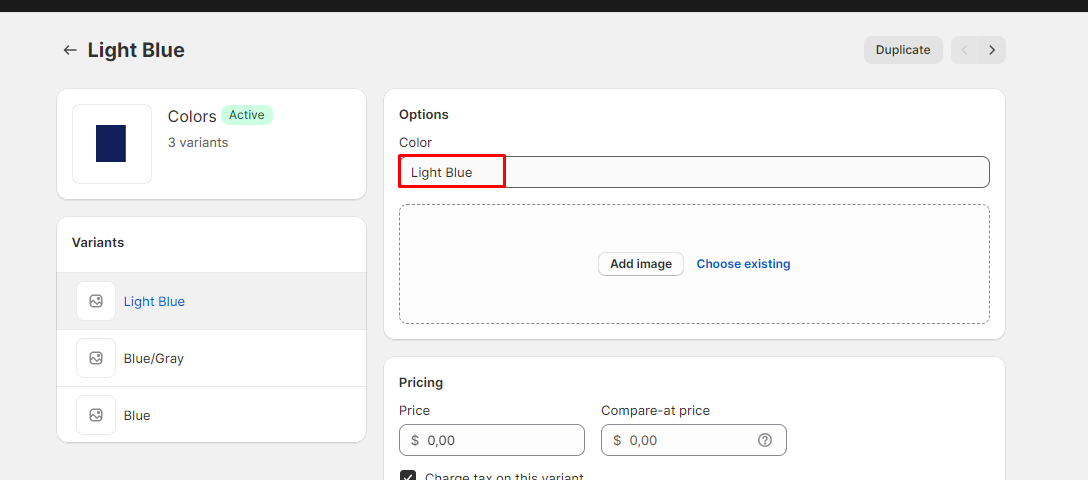
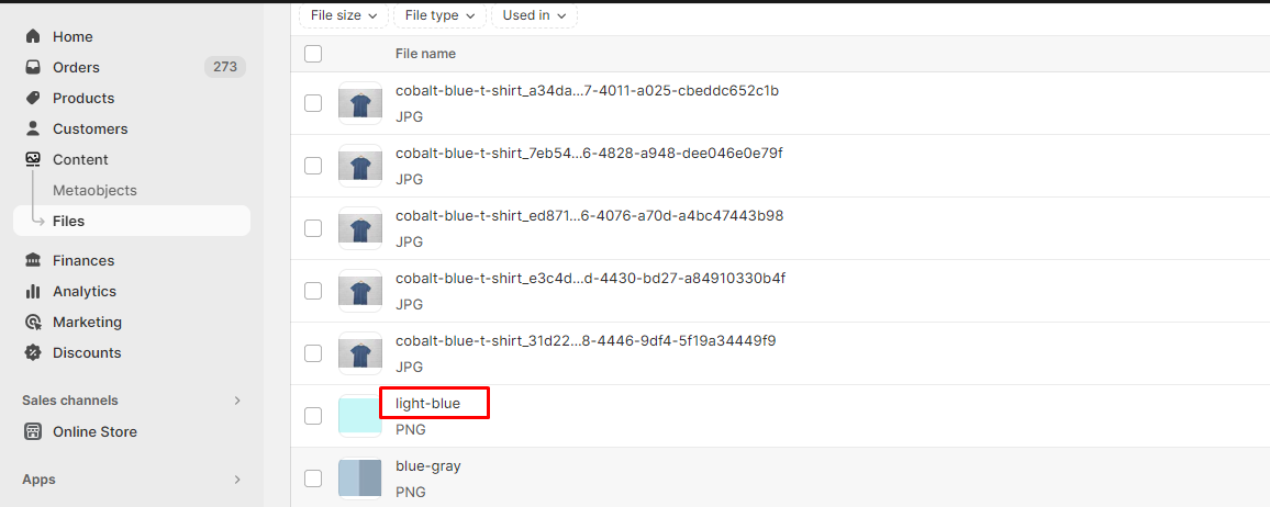
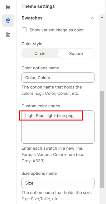
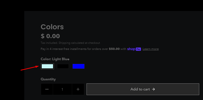
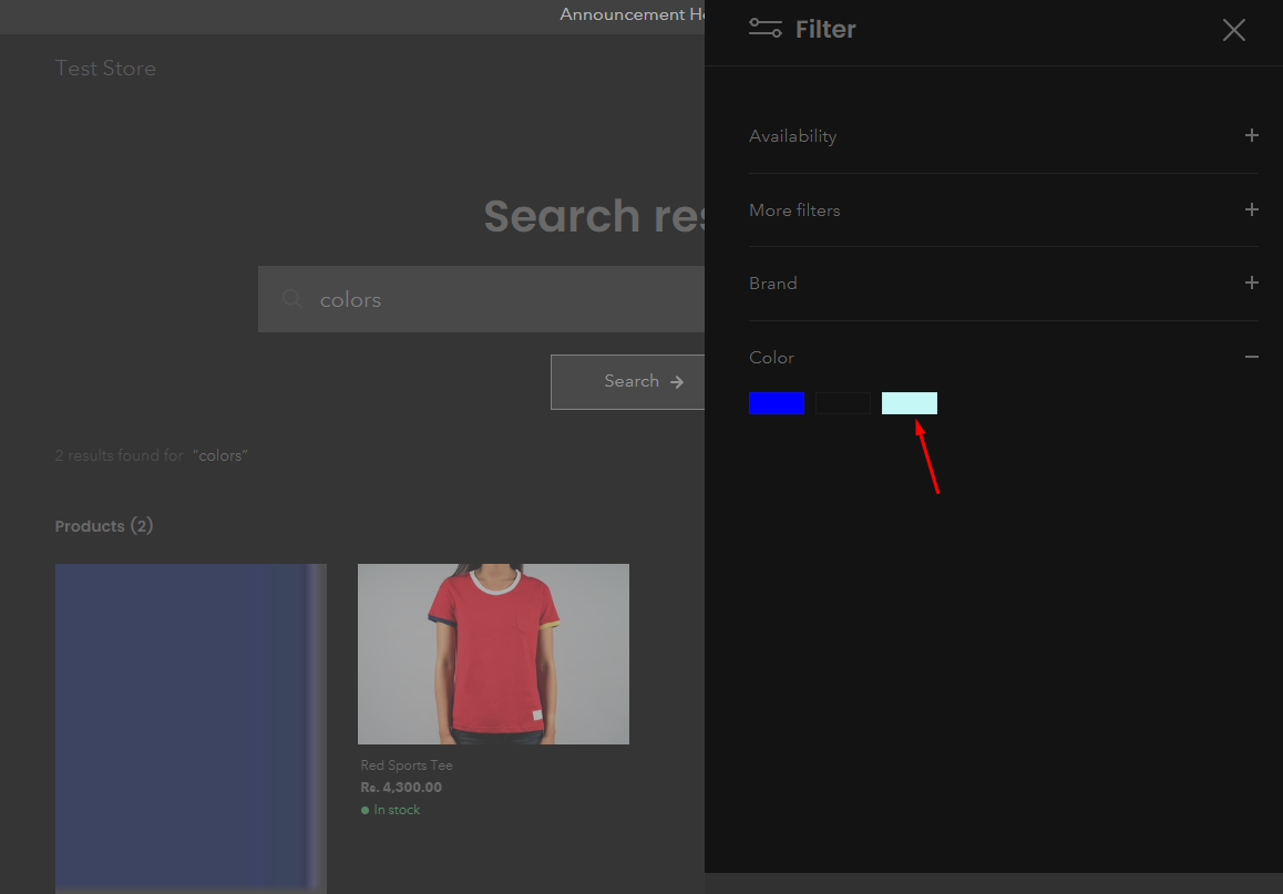
| Show variant image as color | Select checkbox to show variant image as color. | |
| Color style | Select from circle, tiles or square to show the swatches style. (Note: Tiles is not applicable with the variant image.) | |
| Color options name | Enter the option name that holds the colors. E.g., Color, Colour, etc. | |
| Custom color codes | Add color codes for the options as per the following details: The left-side options will be the names of the categories that hold the colors (e.g., Color, Material), while the right-side values will be the corresponding color codes, separated by an equals sign. For example, if the variant name is "plaid" under the "Color" category, the color code should be entered as "plaid:#ccc." (Please note that the color option names are case-sensitive.) | |
| Size options name | Enter the option name that holds the size. E.g.: Size,Taille, etc. |

| Enable quick view | Select checkbox to show the quick view icon on products. |
| Enable fullwidth | Select the checkbox to show the quick view in full width. |
| Enable product title marquee | Select the checkbox to show the marquee text of the product name in the quick view. |
| Enable description | Select the checkbox to show the product description in quick view. |
| Marquee text opacity | Adjust the range bar to select the marquee text opacity in the quick view. |
| Full width popup animation | Select the full width popup animation from boom or rings. |
| Gallery style | Select the gallery style from list or grid. |
| Emphasize first image in grid view | Select the checkbox to emphasize the first image in the grid view of quick view. |
| Color scheme | Select the color scheme options from the options; -Primary -Secondary -Tertiary -Quaternary
These can be managed from Theme settings> color schemes. |
| Space between grids desktop | Adjust the range bar to select the columns gap in product grids on the desktop view. | |
| Space between grids mobile | Adjust the range bar to select the columns gap in product grids on the mobile view. | |
| Hover options | Select the hover options from the options below; -None -Carousel -Second Image | |
| Carousel navigation | Select from arrows or tiles to show the carousel navigation style in the product grids. | |
| Enable border | Select/deselect the checkbox to show/hide product borders. | |
| Border width desktop | Adjust the range bar to select the border width of product grids on the desktop view. | |
| Border width mobile | Adjust the range bar to select the border width of product grids on the mobile view. | |
| Show grid shadow | Select this chieckbox to show the product grid's shadow. | |
| Show vendor | Select/deselect the checkbox to show/hide the product vendor name. | |
| Enable quick view | Select/deselect the checkbox to show/hide a quick view icon from the product grids. | |
| Enable ATC button | Select/deselect the checkbox to show/hide add to cart icon from the product grids. (Note: This icon shows on products with one variant only.) | |
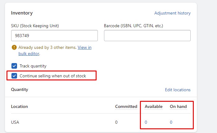
| Show inventory | Select/deselect this checkbox to show the inventory status of products in the product grids. | |
| Low inventory threshold | Adjust the slider to select the minimum inventory threshold. | |
| Enable swatches | Select/deselect the checkbox to show/hide the color swatches from the product grids. | |
| Desktop position | Select from On image or Below image to show color swatches on the desktop. | |
| Mobile position | Select from On image or Below image to show color swatches on the mobile. | |
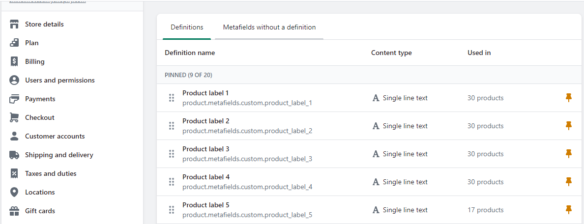
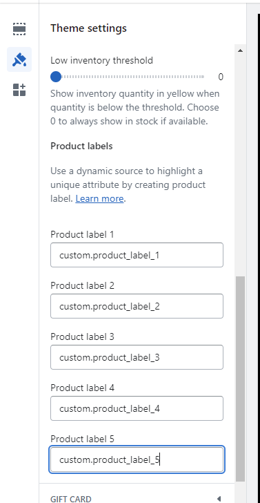
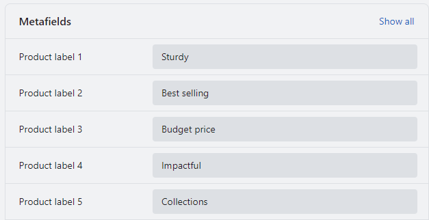
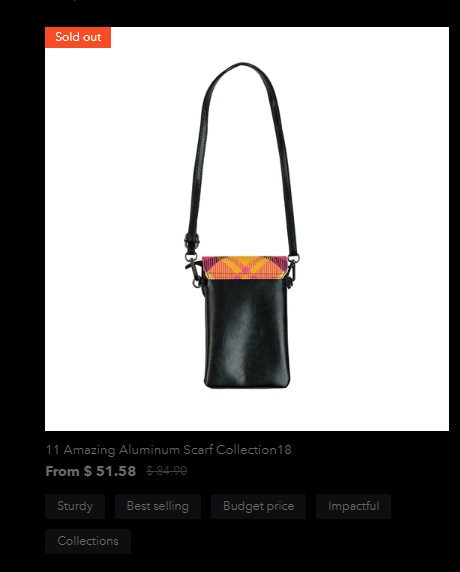
| Product label 1-5 | Add the product labels set up in the metafields as explained below. | |
| Badges | Show sold out badge Select/deselect the checkbox to show/hide the sold-out badge. Show price savings Select/deselect the checkbox to show/hide price savings badge. Show preorder badge Select/deselect the checkbox to show/hide the preorder badge. | |
| Custom badge | Product tag Add the product tag, for which the custom badge will start showing. Badge text Enter the custom badge text. |
| Cart drawer | |
|---|---|
| Enable | Select this checkbox to show the cart drawer. |
| Enable notes | Select this checkbox to show the cart notes in the cart drawer. |
| Gift wrap>Enable gift wrap | Select this checkbox to enable the gift wrapping. |
| Gift wrap>Product | Select any product to include in the gift wrap. |
| Gift wrap>Text | Type any text to show with the gift wrapping checkbox. |
| Enable shipping bar | Select this checkbox to enable/disable the shipping bar on the cart drawer. (Note: This feature only works with a shipping method. If you're using multiple shipping methods, it might show false values to the customer.) |
| Minimum shipping price | Type any price for providing free shipping to the customers. After reaching this price, the user will be shown a success message. (Note: Users must write a number, no letters or special characters.) |
| Message | Type any relevant message to notify users about the amount saved in this field. (Note: Use ||amount|| to display the amount within the message.) |
| Success message | Enter text to show the success message after the user has reached the minimum shipping price. |
| Empty cart | Heading Enter any text to appear as a title. Menu Choose any menu to display in case of empty cart. (Note: This menu won't show dropdown items.) |
| Logo image | Select an image to add a logo on the gift card page. |
| Custom logo width | Adjust the slider to select the logo width. |
| Color scheme | Select the color scheme options from the options; -Primary -Secondary -Tertiary -Quaternary
These can be managed from Theme settings> color schemes. | |
| Suggestions | Heading -Auto -Landscape -Portrait -Square | |
| Search results | Product image ratio Select product image ratio from the given options: -Auto -Landscape -Portrait -Square Article image ratio Select the article image ratio from the given options: -Auto -Landscape -Portrait -Square |
| Drawer | Color scheme -Primary -Secondary -Tertiary -Quaternary
These can be managed from Theme settings> color schemes. |
| Popup | Color scheme -Primary -Secondary -Tertiary -Quaternary
These can be managed from Theme settings> color schemes. |
| Disable microdata schema | Select this checkbox to disable the microdata schema. (Note: This will remove the schema.org markup from the page. Disable only if you are using a third-party app for SEO.) For more info, please go through docs. |
| Remove the collection portion from product URLs for better SEO | Select this checkbox to remove the collection portion from product URLs for better SEO. |
| Add Link to your Facebook Handle. | ||
| Add Link to your Twitter Handle. | ||
| Add Link to your Instagram Handle. | ||
| Add Link to your Pinterest Handle. | ||
| Snapchat | Add Link to your Snapchat Handle. | |
| Add Link to your LinkedIn Handle. | ||
| TikTok | Add Link to your TikTok Handle. | |
| YouTube | Add Link to your You Tube Handle. |
| Enable newsletter popup | Select/deselect the checkbox to enable newsletter popup. | |
| Heading | Add text to display as title on the Newsletter popup. | |
| Sub heading | Add text to display subheading on the Newsletter popup. | |
| Description | Add text to display as brief about the Newsletter popup. | |
| Set cookie for newsletter popup (days) | Adjust the slider to set the time(days) for which you want the cookies to expire. |
| Enable age verification popup | Check the box to enable the age verification pop-up on the storefront. |
| Logo | Select any image to show as logo. |
| Heading | Type any text to show as heading on the popup. |
| Enable highlight text | Select the checkbox to show the highlighted text. (Note: Highlight text works on bold and italic text of the heading.) |
| Sub-heading | Type any text to show as sub-heading on the popup. |
| Description | Type any text to show as description on the popup. |
| Approve button text | Type any text to show above the approve button on the popup. |
| Decline button text | Type any text to show above the decline button on the popup. |
| Under 18 title | Type any text to show as a title on the popup when users click the decline button. |
| Under 18 description | Type any text to show as a description on the popup when users click the decline button. |
| Decline button text | Type any text to show above the decline button on the popup. |
| Enable | Select this checkbox to enable the scroll to top icon. | |
| SVG code | Add custom SVG code. | |
| Horizontal position | Users can adjust the position from the given options : -Left -Center -Right | |
| Vertical position | Adjust the slider to set the vertical position of icon. |
| Icon | Select any icon to appear as a favicon. |
| Banner | Background image Upload a background image for the checkout banner section. | |
| Logo | Add your brand’s logo to the banner section. | |
| Position | Select any required position from Left, Center & Right | |
| Logo size | - Select the logo size from the given options; -Small -Medium -Large | |
| Main content area | Background image Upload a background image for the main content area.
Select any color for background. Select form field for the given options; -White -Transparent |
| Background image | Add background image for the order summary. | |
| Background color | Select any background color. |
| Heading | Select the suitable font for headings. | |
| Body | Select the suitable font for body. |
| Accents | Select the suitable colors for accents on the checkout page | |
| Buttons | Select the suitable colors for buttons. | |
| Errors | Select the suitable colors for errors. |