| Background | Select the background color. |
| Alternate background | Select an alternate background color. |
| Background gradient | Select gradient for the background color. |
| Heading | Select color for the heading text. |
| Highlight color | Select color for the highlighted text. |
| Text | Select color for the text. |
| Link | Select color for the links. |
| Primary button | Background Select the button background color. Shadow Select the button shadow color. Text Select the button text color. Border Select the button border's color. Hover background Select the button's background color on hover. Hover text Select the button's text color on hover. Hover border Select the button's border color on hover. |
| Secondary button | Background Select the button background color. Shadow Select the button shadow color. Text Select the button text color. Border Select the button border's color. Hover background Select the button's background color on hover. Hover text Select the button's text color on hover. Hover border Select the button's border color on hover. |
| Input | Background Select the input field's background color. Text Select the input field's text color. Border Select the input field's border color. |
| Others | Product border Select the product's border color. Product media background Select the product's media background color. Line/Divider Select the divider's color. Ratings Select the rating star's color. |
| Slider arrows | Arrow background Select the slider arrow's background color. Arrow color Select the slider arrow's text color. |
| Product card | Background Select the product card's background color. |
| Background | Select the header's background color. |
| Text | Select the header's text color. |
| Hover text | Select the header's text color on hover. |
| Secondary background | Select the header's secondary background color. |
| Secondary text | Select the header's secondary text color. |
| Secondary hover text | Select the header's secondary text color on hover. |
| Icon color | Select the header icon's color. |
| Cart count background | Select the cart count background color. |
| Cart count text | Select the cart count text color. |
| Search text | Select the search's text color. |
| Search background | Select the search's background color. |
| Transparent header | Text/icons Select the text color for the transparent header. |
| Submenu level 1 | Sub menu background Select the sub menu's background color. Sub menu text Select the sub menu's text color. Sub menu text hover Select the sub menu's text color on hover. |
| Submenu level 2 | Sub menu background Select the sub menu's background color. Sub menu text Select the sub menu's text color. Sub menu text hover Select the sub menu's text color on hover. |
| Mega menu overlay | Select the mega menu's overlay color. |
| Mega menu overlay text | Select the mega menu's overlay text color. |
| Background | Select any color for the footer background. |
| Compact background | Select any color for the footer compact background. |
| Text | Select any color for the footer text. |
| Link | Select any color for the footer links. |
| Link hover | Select any color for the footer links hover. |
| Button background | Select the button background color. |
| Button text | Select the button text color. |
| Button border | Select the button border's color. |
| Button background hover | Select the button's background color on hover. |
| Button text hover | Select the button's text color on hover. |
| Button border hover | Select the button's border color on hover. |
| Divider | Select the divider's color. |
| Input/button shadow | Select the input/button's shadow color. |
| Background overlay | Select any color for the background overlay. |
| Bottom bar | Text Select any color for the footer text on the bottom bar. Link Select any color for the footer links on the bottom bar. Link hover Select any hover color for the footer links on the bottom bar. |
| Background | Select any color for the background of the scroll to the top button. |
| Color | Select any color for the icon of the scroll to the top button. |
| Header | |
|---|---|
| Success | Select any color for the header background. |
| Error | Select any color for the header text. |
| Sale background | Select any sale badge's background color. | |
| New background | Select any new badge's background color. | |
| Sold background | Select any sold badge's background color. | |
| Preorder background | Select any preorder badge's background color. | |
| Custom background | Select any custom badge's background color. |
| Background | Select the discount's background color. |
| Text | Select the discount's text color. |
| Marquee text soild | Select any color for the marquee solid text. |
| Marquee text gradient | Select any color for the marquee gradient text. |
| Headings | Font Select the font of the heading text. Adjust the line height for headings used in all sections. Desktop | |
| Body | Font Select the font of the body text. Adjust the line height for headings used in all sections. Desktop |
| Product grid | Desktop Adjust the range bar to select the border radius of product grids on the desktop view. Mobile Adjust the range bar to select the border radius of product grids on the mobile view. |
| Images | Desktop Adjust the range bar to select the border radius of images on the desktop view. Mobile Adjust the range bar to select the border radius of images on the mobile view. |
| Input | Desktop Adjust the range bar to select the border radius of input fields on the desktop view. Mobile Adjust the range bar to select the border radius of input fields on the mobile view. |
| Box grids | Desktop Adjust the range bar to select the border radius of the box grids on the desktop view. Mobile Adjust the range bar to select the border radius of the box grids on the mobile view. |
| Enable button shadow | Tick this checkbox to show the button's shadow throughout the store. |
| Enable round button | Tick this checkbox to show the rounded buttons throughout the store. |
| Text transform | Select from the capitalize or uppercase to determine the button text casing. |
| Enable round button | Select this checkbox to show the rounded button. |
| Border radius | Desktop Adjust the range bar to determine the button border radius on the desktop view. Mobile Adjust the range bar to determine the button border radius on the mobile view. |
| Hover effect | Choose from Normal or Glowing for the button hover effect. |
| Arrow>Enable arrow shadow | Tick this checkbox to show the arrows shadow throughout the store. |
| Container width | Choose from small, medium or large to determine the container width. |
| Background overlay | Enable blur effect Tick the checkbox to enable the blur effect in the background overlay. Color Choose any color. Opacity Adjust the range bar to determine the background overlay opacity. |
| Enable border | Tick the checkbox to show the product borders. |
| Enable border on hover | Tick the checkbox to show the product borders on hover only. |
| Enable inner padding | Tick the checkbox to show the inner padding in the product grids. |
| Enable background | Tick the checkbox to show the background color in the product grids. |
| Show product price | Tick the checkbox to show the product price in the grids. |
| Show second image on hover | Tick the checkbox to show the product's second image on hover. |
| Show price savings | Tick the checkbox to show the product's saving price which is the price difference between the compare price and sale price. |
| Saved amount type | Select from percentage off or amount off to determine the saved amount type. |
| Title style | Choose the product title style from Normal or Bold. |
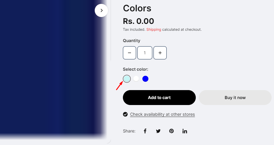
| Enable color swatches | Tick the checkbox to display the product color swatches in the grid. |
| Show video on grid | Tick the checkbox to autoplay the Shopify-hosted videos in the product grid. |
| Show product vendor | Tick the checkbox to show the product vendor name. |
| Show product ratings | Tick the checkbox to show the product rating stars. |
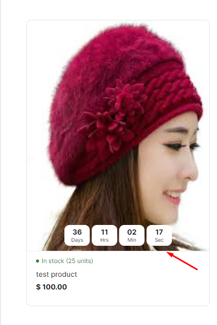
| Show product inventory | Tick the checkbox to show the product inventory in the grids. |
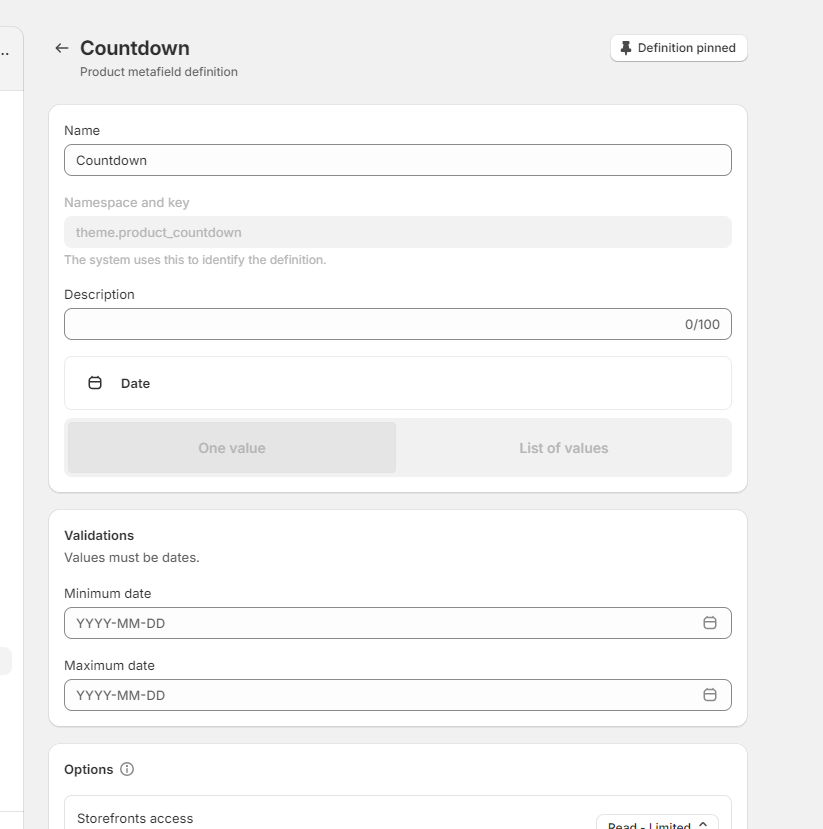
| Show product countdown | Tick the checkbox to show the product countdown timer in the grids. These countdowns are managed with the meta fields. |
| Show marquee text | Tick the checkbox to show the marquee text on the product grids. (Note: Add product-specific meta field with namespace and key- theme.marquee_text and type- text to show the marquee text in the grid.) |
| Marquee direction | Choose the product grid marquee direction from the following options: - Left to right - Right to left |
| Desktop scrolling speed | Adjust the range bar to determine the marquee text's scrolling speed on the desktop. |
| Mobile scrolling speed | Adjust the range bar to determine the marquee text's scrolling speed on the mobile. |
| Show quick view | Tick the checkbox to show the quick view on the grids. |
| Show quick view on hover | Tick the checkbox to show the quick view on hover in the product grid. |
| Quick view style | Choose from button or icon to determine the quick view style. |
| Show compare | Tick the checkbox to show the compare icon on the grids. (Note: To change the view of the product comparison popup, go to the 'Product comparison' section below the footer group.) |
| Content alignment | Choose the content alignment from left or center. |


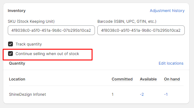
| Enable preorder | Tick the checkbox to show the preorder button. It shows for the products with enabled 'Continue selling when out of stock.' |
| Low inventory threshold | Adjust the range bar to determine the low inventory threshold. |
| Style | In stock Select the color for the in-stock text color. Low stock Select a color for the low-stock text color. Out of stock Select a color for the out of stock text color. |
| Terms and conditions | Show terms and conditions checkbox Tick the checkbox to show the terms and conditions text on the product templates. Text Enter the text for terms and conditions. |
| Add to cart alerts | Audio alert Choose from the list of options to determine the audios for the alerts by clicking on the add to cart button. Haptic feedback Tick this checkbox to enable the haptic feedback. (Note: It does not work on IOS devices.) Enable the shake effect Tick this checkbox to enable the shake effect on the click of the add to cart button. |
| Style | Choose the product badges style from the following options: - Adjacent - Floating. |
| Sale badge | Show 'Sale' badge Tick this checkbox to show the 'Sale' badge based on the conditions selected below. Note: The sale badge shows on the products where the compare price is defined from the Shopify product side. |
| Sold out badge | Show 'Sold out' badge Tick this checkbox to show the 'Sold out' badge. |
| New badge | New badges can be displayed under various conditions, including:
|
| Preorder badge | Show 'Preorder' badge Tick this checkbox to show the preorder badges on the product grids. This preorder shows for the products whose 'Continue selling out of stock' is checked from the admin product side.  |
| Custom badge | Enable badges animation Tick this checkbox to enable the custom badges animation in the product grids. Change badge every second Adjust the range bar to determine the seconds for the changing badges. Product tag 1-3 Add custom labels in the product tags and then type those in this field. The tags will start showing on the storefront. Badge text 1-3 Type the badge text to display. Show custom badge on product images Tick this checkbox to show the custom badges above the product images. |
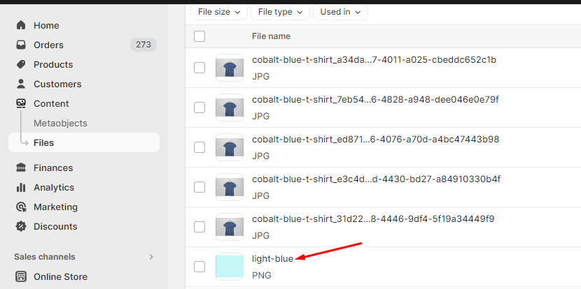
| Show variant image as color | Tick the checkbox to show variant image as color. | |
| Show label with swatch | Tick the checkbox to show the product option labels above the swatches. | |
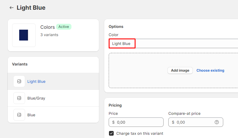
| Color options name | Enter the option name that holds the colors. E.g., Color, Colour, etc. | |
| Custom color codes | Add color codes for the options as per the following details: The left-side options will be the names of the categories that hold the colors (e.g., Color, Material), while the right-side values will be the corresponding color codes, separated by an equals sign. For example, if the variant name is "plaid" under the "Color" category, the color code should be entered as "plaid:#ccc." (Please note that the color option names are case-sensitive.) | |
| Size options name | Enter the option name that holds the size. E.g.: Size,Taille, etc. |
| Cart drawer | |
|---|---|
| Cart type | Select from Drawer or Page to show the cart type. |
| Enable notes | Select this checkbox to show the cart notes in the cart drawer. |
| Gift wrap>Enable gift wrap | Tick this checkbox to show the gift wrap in the cart drawer. |
| Gift wrap>Product | Select any product to include in the gift wrap. |
| Gift wrap>Text | Type any text to show with the gift wrapping checkbox. |
| Enable shipping bar | Select this checkbox to enable/disable the shipping bar on the cart drawer. (Note: This feature only works with a shipping method. If you're using multiple shipping methods, it might show false values to the customer.) |
| Enable confetti effect | Select this checkbox to enable the confetti effect when the minimum spend is reached. |
| Minimum shipping price | Type any price for providing free shipping to the customers. After reaching this price, the user will be shown a success message. (Note: Users must write a number, no letters or special characters.) |
| Message | Type any relevant message to notify users about the amount saved in this field. (Note: Use ||amount|| to display the amount within the message.) |
| Success message | Enter text to show the success message after the user has reached the minimum shipping price. |
| Terms and conditions | Show terms and conditions checkbox Tick the checkbox to show the terms and conditions text on the product templates. Text Enter the text for terms and conditions. |
| Enable on desktop | Select this checkbox to enable cart recommendations on the desktop. |
| Heading | Enter the heading text. |
| Choose products | Select products to show the recommendations. |
| Button | Text Add text to the highlight button. Link Add a link to your button. |
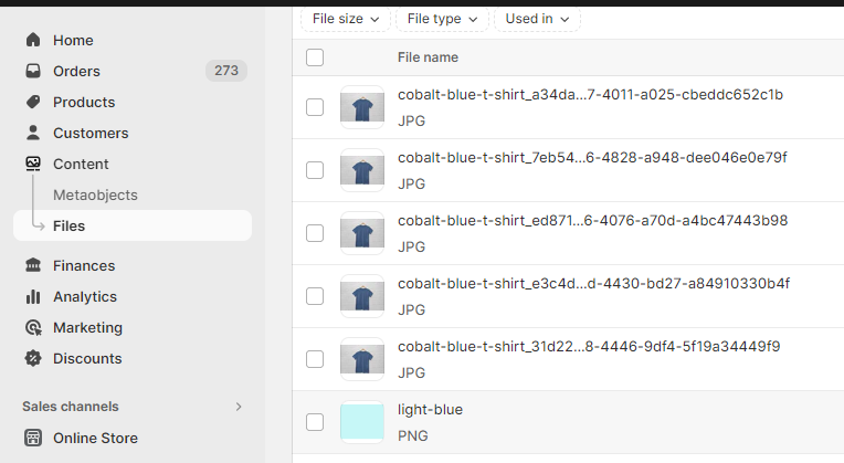
| Banner 1-4 | Image Choose an image from the library. Subheading Enter the subheading. Heading Enter the heading. |
| Logo image | Select an image to add a logo on the gift card page. |
| Custom logo width | Adjust the slider to select the logo width. |
| Logo alignment | Select from left or center to determine the logo alignment. |
| Search style | Choose the search style from the following options: - Full width - Side drawer (Note: This setting is applicable to search drawer using 'Logo with inline menus' and 'Hamburger menus' header styles only.) | |
| Suggestions | Enable suggestions -Auto -Landscape -Portrait -Square | |
| Search results | Show articles Select product image ratio from the given options: -Auto -Landscape -Portrait -Square Select the article's image ratio from the given options: -Auto -Landscape -Portrait -Square Select the collection's image ratio from the given options: -Auto -Landscape -Portrait -Square | |
| Colors | Color scheme Select the color scheme. Enable gradient Select this check box to enable the gradient color specified in the color scheme assigned above. |
| Drawer | Color scheme Select the color scheme. Enable gradient Select this check box to enable the gradient color specified in the color scheme assigned above. |
| Popup | Color scheme Select the color scheme. Enable gradient Select this check box to enable the gradient color specified in the color scheme assigned above. |
| Enable dark/light mode toggle | Tick this checkbox to show the toggle button in the header. Style Select the dark/light button style from Toggle or Button. Colors Select the colors for the dark/light mode toggle button's colors. |
| Tab attention | Show attention messages when the browser tab loses focus Tick this checkbox to show the messages on the browser tab whenever the storefront users lose focus. This feature is useful to grab the attention of storefront users. Message 1 Type message one here. Message 2 Type message two here. (Note: Messages one and two keep on interchanging to grab the storefront user's attention.) Message delay Adjust the range bar to determine the delay between the interchange of messages on the browser tab. |
| Enable | Select this checkbox to enable the scroll to top icon. | |
| SVG code | Add custom SVG code. Not: SVG should have width and height attributes. | |
| Horizontal position | Users can adjust the position from the given options : -Left -Center -Right | |
| Vertical position | Adjust the range bar to set the vertical position of icon. |
| Icon | Select any icon to appear as a favicon. |
| Banner | Background image Upload a background image for the checkout banner section. | |
| Logo | Add your brand’s logo to the banner section. | |
| Position | Select any required position from Left, Center & Right | |
| Logo size | - Select the logo size from the given options; -Small -Medium -Large | |
| Main content area | Background image Upload a background image for the main content area.
Select any color for background. Select form field for the given options; -White -Transparent |
| Background image | Add background image for the order summary. | |
| Background color | Select any background color. |
| Heading | Select the suitable font for headings. | |
| Body | Select the suitable font for body. |
| Accents | Select the suitable colors for accents on the checkout page | |
| Buttons | Select the suitable colors for buttons. | |
| Errors | Select the suitable colors for errors. |