Theme settings
siThese settings are the King theme’s general settings for your Shopify store.
Configure theme settings
Go to Customize theme.
Click on Theme settings to access theme-wide settings.
Customize the sections by utilizing the settings described below:
Favicon
Image: Choose any image for the store library.
Colors
Default color scheme: Choose any color scheme to be the default one.
Background
Select the background color.
Background gradient
Select gradient for the background color.
Alternate background
Select an alternate background color.
Corners top background
Select color for the background color of the top corners.
Corners bottom background
Select color for the background color of the bottom corners.
Border
Select color for the border.
Content
Heading Select color for the heading text. Text Select color for the text. Link Select color for the links. Link hover Select color for the links hover.
Subheading highlights
(Note: These colors work for the markers applied to the section subheadings.) Text Select color for the subheading text. Background Select color for the subheading background.
Heading highlights
(Note: These colors work for the markers applied to the section headings.) Outline text Select color for the outline text. In text gradient Select color for the in text gradient of the headings. Background gradient Select color for the background gradient of the headings. Shape gradient Select color for the shape gradient of the headings.
Primary & Secondary button
Label Select the button label color. Background Select the button background color. Border Select the button border's color. Label hover Select the button's text color on hover. Background hover Select the button's background color on hover. Background gradient Select the button's gradient background color. (Note: It replaces the solid background color.)
Image
Background Select the image's background color. Background gradient Select the button's gradient background color. (Note: It replaces the solid background col Overlay background Select the image's overlay background color. Overlay heading Select the image's overlay heading color. Overlay text Select the image's overlay text color. (Note: The image overlay colors work for the images, which are mandatory for the sections.)
Form fields
Background Select the input field's background color. Text Select the input field's text color. Border Select the input field's border color.
Slider arrow/dots, icons, comparison pin
Background Select the slider arrow's background color. Color Select the slider arrow's text color.
Card
Background Select the card's background color. Alternate background Select card's alternate background color. Heading Select color for the card's heading text. Text Select color for the card's description text. Background gradient Select the card's background gradient color. Border Select the card's border color.
Popup/Drawers/Menus
Color scheme
Select any color scheme defined in the theme settings>Colors>Schemes.
Overlay
Choose any color for the overlay, which appears on opening the popups, drawers or menus.
Overlay opacity
Adjust the range bar to determine the overlay color's opacity.
Badges
Sale text
Select any text color for sale badges.
Sale background
Select any background color for sale badges.
Soldout text
Select any text color for sold out badges.
Soldout background
Select any background color for sold out badges.
Preorder text
Select any text color for preorder badges.
Preorder background
Select any background color for preorder badges.
Discount text
Select any text color for discount badges.
Discount background
Select any background color for discount badges.
Custom text
Select any text color for custom badges.
Custom background
Select any background color for custom badges.
Success/Error messages
Success text
Select any text color for success text.
Error text
Select any text color for error text.
Warning text
Select any text color for warning text.
Header
Typography
First level menus Font Choose the first level menus font family from the following options:
- Heading - Body - Accent (Note: These fonts can be changed in theme settings>typography.) Size Select the first level menus font size from the following options: - X- large - Large - Medium - Normal - Small - X-small - XX-small Second level menus
Font Choose the second level menus font family from the following options:
- Heading - Body - Accent (Note: These fonts can be changed in theme settings>typography.) Size Select the second level menus font size from the following options: - X- large - Large - Medium - Normal - Small - X-small - XX-small Third level menus Font Choose the third level menus font family from the following options:
- Heading - Body - Accent (Note: These fonts can be changed in theme settings>typography.) Size Select the third level menus font size from the following options: - X- large - Large - Medium - Normal - Small - X-small - XX-small
Colors
Text Select the header's text color. Text hover Select the header's text color on hover. Background Select the header's background color. Border Select the header's border color. Border opacity Adjust the range bar to determine the border color's opacity. Submenus Text Select the submenus text color. Text hover Select the submenus text color on hover. Background Select the submenus background color. Transparent header
Text/icon Select the text color to display on the transparent header. Border Select the color for the border on the transparent header. Border opacity Adjust the range bar to determine the border color's opacity. Overlay Choose any color for the overlay. Overlay opacity Adjust the range bar to determine the overlay color's opacity.
Hamburger menu
Color scheme Select any color scheme defined in the theme settings>Colors>Schemes.
Typography
This setting allows customizing fonts.
Headings
Font
Select the font of the heading text.
Line height
Adjust the line height for headings used in all sections. Font size scale
Adjust the range bar to set the font size scale. Letter spacing Choose the letter spacing from the available list of options.
Body
Font
Select the font of the body text.
Line height
Adjust the line height for headings used in all sections. Font size scale
Adjust the range bar to set the font size scale. Letter spacing Choose the letter spacing from the available list of options.
Accents
Font
Select the font of the accents text.
Line height
Adjust the line height for headings used in all sections. Font size scale
Adjust the range bar to set the font size scale. Letter spacing Choose the letter spacing from the available list of options.
Layout
Card radius
Adjust the range bar to select the border radius of cards.
Buttons
Buttons
Size Select from the following options to determine the button size: - Small - Medium - Large Style Choose the button style from the following options: - Animated - Outlined - Link - Solid - Solid animated
Border
Corner radius Adjust the range bar to select the corner radius of the buttons.
Font
Choose the button's font family from the following options:
- Heading - Body - Accent (Note: These fonts can be changed in theme settings>typography.)
Inputs
Border
Thickness Adjust the range bar to select the thickness of forms borders. Opacity Adjust the range bar to select the opacity of forms borders. Corner radius Adjust the range bar to select the border radius of page forms.
Product
Default product image
Choose any image to show for the products having no image.
Interlink tabs with sections
(Note: Enable this option to show the Section ID clipboard in design mode (customizer mode) only. This feature helps merchants easily interlink product information sections using Interlink Tabs.
Interlink Tabs are blocks defined in the product information section. Click the copy icon to copy the Section ID to your clipboard. You can then paste the copied ID into the Section ID input box of the Interlink Tab block.) Show section ID on the clipboard Select this checkbox to show the Section ID in the theme editor preview.
Product cards
Strip title to 1 line
Select this checkbox to decrease the product title to one line only.
Hover style
Choose the style from below options: - None - Product options - Second image - All
Quick view visibility
Choose the quick view visibility from below options: - None - Always - On hover
Corner radius
Adjust the range bar to determine the radius in the grids.
Product options
Content
Show vendor Select the checkbox to show the product vendor name. Font Choose the product card's font family from the following options:
- Heading - Body - Accent (Note: These fonts can be changed in theme settings>typography.) Alignment Choose the content alignment from the following options: - Left - Center - Right Size Select the product card's font size from the following options: - X- large - Large - Medium - Normal - Small - X-small - XX-small
Badges
Show 'Sale' badge Select this checkbox to show the 'Sale' badge based on the conditions selected below. (Note: The sale badge shows on the products where the compare price is defined from the Shopify product side.) Show 'Sold out' badge Select this checkbox to show the ' Sold out ' badge. Show 'Preorder' badge Select this checkbox to show the preorder badges on the product grids (Note: This preorder shows for the products whose ' Continue selling out of stock' is checked from the admin product side.)
Custom badge
Product tags Add custom labels in the product tags and then type those in this field. The tags will start showing on the storefront. Custom badge text Type the badge text to display.
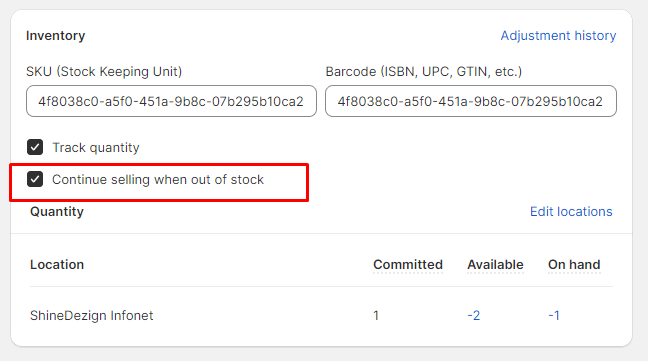
Steps to enable preorder:
This preorder shows for the products whose ' Continue selling out of stock' is checked from the admin product side.
Swatches
Color options trigger
Enter the color option name. (Note: The option name that holds the colors. E.g.: Color, Colour, Material, etc.)
Size options trigger
Enter the size option name. (Note: The option name that holds the size. E.g.: Size,Taille, etc.)
Cart/Cart drawer
Style
Choose the cart style from the following options: - Drawer - Page - Popup notification.
Shipping bar
(Note: This feature only works with a shipping method. If you're using multiple shipping methods, it might show false values to the customer.) Enable shipping bar Select this checkbox to enable/disable the shipping bar on the cart drawer. Minimum shipping price Type any price for providing free shipping to the customers. After reaching this price, the user will be shown a success message.
(Note: Users must write a number, no letters or special characters.) Message Type any relevant message to notify users about the amount saved in this field.
(Note: Use ||amount|| to display the amount within the message.) Success message Enter text to show the success message after the user has reached the minimum shipping price.
Gift wrap
Enable gift wrap Tick this checkbox to show the gift wrap in the cart drawer. Product Select any product to include in the gift wrap. Text Type any text to show with the gift wrapping checkbox.
Empty cart details
Heading Enter the heading text. Description Enter the description text. Button label Enter the button label text e.g. Continue shopping. Button link Add the link to redirect the button. Collections Choose the collections list.
Cart drawer
Enable cart notes Select this checkbox to show the cart notes in the cart drawer. Show estimate shipping Select this checkbox to show estimate shipping in the cart drawer. Cart recommendations Style Choose the style from below options: - Complementary products - Products list - None (Note: To select related products, add the Search & Discovery app.) Heading Enter the heading text. Products list Choose the products list.
Search/ Search drawer
Style
Choose the search style from the following options: - Page - Drawer
Drawer style
Choose the drawer style from the following options: - Fullscreen - Half screen
Search suggestions
Enable predictive search Select this checkbox to enable the predictive search. Enable recent searches Select this checkbox to show the recent searches. Image ratio Choose from image's ratio in the grid from the following options: - Auto - Square - Landscape - Portrait
Popular collections
Heading Enter the heading text. Heading size Select the heading size from the following options: - XXX- large - XX- large - X- large - Large - Medium - Small - X-small Collections Choose the collections list from the store.
Product recommendation
Heading Enter the heading text. Heading size Select the heading size from the following options: - XXX- large - XX- large - X- large - Large - Medium - Small - X-small Product list Choose the products list from the store.
Article cards
Strip title to 1 line
Select this checkbox to show article's title in one line only.
Strip content to 2 lines
Select this checkbox to show article's description in two lines only.
Internationalization
Enable language selector
Select this checkbox to show the language selector.
Enable country/region selector
Select this checkbox to show the country/region selector.
Scroll to top
Enable
Select this checkbox to enable the scroll to top icon.
Horizontal position
Choose the icon position from the following options: - Left - Center - Right
Vertical position
Adjust the range bar to determine the vertical position of this icon.
Colors
Background Choose any color for the icon background. Icon Choose any color for the icon. Border Choose any color for the border.
Social media
Social accounts
These options are to show the merchant's social networking pages. Facebook Enter the Facebook account link. X (formerly Twitter) Enter the Twitter account link. Instagram Enter the Instagram account link. YouTube Enter the YouTube account link. TikTok Enter the TikTok account link. Snapchat Enter the Snapchat account link. Pinterest Enter the Pinterest account link. Tumblr Enter the Tumblr account link. Vimeo Enter the Vimeo account link.
Sharing options
These options are useful to share the product, articles on the social networking sites. Share on Facebook Select this checkbox to share on Facebook. Tweet on X (formerly Twitter) Select this checkbox to share on X (formerly Twitter). Pin on Pinterest Select this checkbox to share on Pinterest. Share on Telegram Select this checkbox to share on Telegram. Share on WhatsApp Select this checkbox to share on Email. Share on Email Select this checkbox to share on Email.
Last updated