Maya
  • Overview
    • 💡Support and documentation
    • ✨Announcement bar
    • ✨Header
    • ✨Slideshow with marquee
    • ✨Hero carousel
    • ✨Trending products
    • ✨Collection carousel
    • ✨Rich text
    • ✨Featured collection
    • ✨Products grid
    • ✨Lookbook
    • ✨Highlight text with image
    • ✨Media with text
    • ✨Collapsible content
    • ✨Blog posts
    • ✨Vertical carousel
    • ✨Burst effects
    • ✨Collection tabs
    • ✨Best selling products
    • ✨Collection list
    • ✨Images comparison
    • ✨Images with text carousel
    • ✨Media with cards
    • ✨Media grid
    • ✨Media with text overlay
    • ✨Scrollable collections
    • ✨Scrolling text
    • ✨Scrollable marquee
    • ✨Testimonials
    • ✨Text with icons
    • ✨Custom liquid
    • ✨Featured product
    • ✨Footer
    • ✨Setup home-two page
    • ✨Theme settings
    • ✨Age verification popup
    • ✨Newsletter popup
    • ✨Template product
    • ✨Setup product specifications on product page
    • ✨Template default collection
    • ✨Template- Blog
    • ✨Template - Default blog post
    • ✨Template- Cart
Powered by GitBook
On this page
  • Configure main product
  • Block settings
  • How to setup the gift product:
  1. Overview

Template product

This section is to maintain the settings of the product page on your store.

Configure main product

Go to Customize theme. Select the Products > Default product template on the top dropdown menu.

From the left side menu, select “Product information.”

Customize the section by utilizing the settings on the right side of the theme editor, as described below:

Main product

Color scheme Select the color scheme.

(Note: These can be managed from Theme settings> color schemes.) Section background Choose the background color from solid or gradient. These colors can be managed in the assigned color scheme. Desktop layout Choose the product gallery layout from the following options: - Center showcase - Sidebar gallery

Center showcase

Open first collapsible row Select this checkbox to keep the first collapsible row open by default.

Media

Enable media zoom Select this checkbox to enable the zoom feature on product images. Enable thumbnails Select this checkbox to enable the product thumbnail images. (Note: This setting is applicable to the Center showcase style only.) Image ratio Select the media ratio from the given options: - Auto - Adapt to first image - Landscape - Portrait - Square Enable video looping Select this checkbox to enable the auto looping of the product videos.

Section spacing

Desktop top space

Adjust the range bar to add spacing at the top of the section for desktop view.

Desktop bottom space

Adjust the range bar to add spacing at the bottom of the section for desktop view.

Mobile top space

Adjust the range bar to add spacing at the top of the section for mobile view.

Mobile bottom space Adjust the range bar to add spacing at the bottom of the section for mobile view.

Block settings

Vendor

This block shows the product vendor.

Title

This block shows the product title. Title size Select the title size from the following options: - XX- large - X- large - Large - Medium - Small - X-small Title tag Specify heading code types from H1-H6, div, span or p tag for SEO and search engines for crawling purposes.

SKU

This block showcases the product SKU value.

Price

This block showcases the product price. Hide shipping content Select this checkbox to hide the shipping content from the price block.

Variant picker

Inventory status bar

Low inventory threshold Adjust this range bar to determine the low stock limit.

Show inventory quantity

Select this checkbox to show the inventory quantity.

Quantity selector

This block displays the quantity selector i.e. used to select the product quantity while making a purchase. Corner radius Adjust this range bar to determine the corner's radius.

Pickup availability

Buy buttons

This block shows the add to cart button. Show dynamic checkout button Select the checkbox to show the dynamic checkout button. Button appearance Size Choose the button size from the following options: - Small - Medium - Large Style Choose the button style from the following options: - Animated - Outline - Solid Show stacked buttons Select the checkbox to show the buttons in stacked view, i.e. in two rows.

Icon with text

Add icons with text to highlight product. Icon 1-3 Icon Choose any icon from the list. Image Add any image for the icon. Label Enter any text for the heading. (Note: Leave the heading label blank to hide the icon column.)

Custom liquid

Liquid Add app snippets or other liquid code for any advanced customizations.

Ask a question

Heading Enter any text to appear as a link to the contact popup. This form sends all submissions to the Sender email address of your store. You can change the sender email address in the Store details settings page of your Shopify admin.

Description

This block is to show the product description at any desired position and choose the visibility. Heading size Select the heading size of description from the following options: - XX- large - X- large - Large - Medium - Small - X-small (Note: This block is not applicable to the 'Sidebar gallery' style.)

Social sharing

This block is to share the product on social media sites. Please go to the theme settings>Social media>Social sharing to choose the options. Share text Enter the text of social sharing icons.

Text

Heading Add text to the heading. Heading size Select the heading size from the following options: - XX- large - X- large - Large - Medium - Small - X-small

Complementary Products

Heading

Collapsible row

Heading Enter any heading. Heading size Select the heading size from the following options: - XX- large - X- large - Large - Medium - Small - X-small Content Enter the custom content/description. It supports dynamic content as well.

Interlink tab

Interlink Tabs are blocks defined in the product information section. Click the copy icon to copy the Section ID to your clipboard. You can then paste the copied ID into the Section ID input box of the Interlink Tab block. To connect this tab with a product information section, follow these steps:

#1. Navigate to the desired product information section.

#2. Copy the section ID by clicking on the copy icon in that section.

#3. Paste the copied section ID into the input field below to establish the connection. Tab label Enter the tab label text. Section ID Paste the section ID here to link the tab with the corresponding product information section. (Note: This section ID is shown on all sections of PDP after enabling it from theme settings>product>Show section ID on clipboard.)

How to setup the gift product:

Go to the product>Gift card template and setup the product, as shown below:

To apply the gift card recipient form settings, Navigate to the Buy button settings, as shown below:

Save the settings and apply this template to the Gift product from store dashboard, as shown below:

PreviousNewsletter popupNextSetup product specifications on product page

Last updated 1 month ago

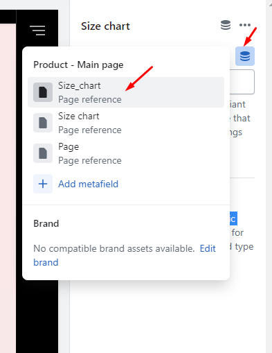
This block showcases the variants list. Style Select from the following options to determine the variant picker type: - Dropdown - Pills Color options Swatch type Choose the swatch type from the following options: - Category meta-fields - Variant image (Note: For category meta-fields colors, please go through ) Appearance Choose the appearance style of the swatches from below options: - Square - Circle - Soft edges Size Choose the size of the swatches from below options: - Small - Medium - Large Other options (Note: The below settings apply to the product options except the color options.) Appearance Choose the appearance style of the product options from below options: - Square - Circle - Soft edges Size Choose the size of the swatches from below options: - Small - Medium - Large Size chart Size chart page This block showcases the size chart in a popup view. Select any page to show as the size chart. Heading Enter text for the heading of size chart.
This block displays pickup availability of the product. For more details, refer to

Add text to the heading to highlight complementary products. Maximum products to show Adjust the slider to highlight products between 2 to 10. Note: To select complementary products, add the Search & Discovery app.

✨
docs.
Learn more
docs.