✨Theme settings
These settings are the Zyra theme’s general settings for your Shopify store.
Configure theme settings
Go to Customize theme.
Click on Theme settings to access theme-wide settings.
Customize the sections by utilizing the settings described below:
Colors
Default color scheme: Choose any color scheme to be the default one.
Background
Select the background color.
Background gradient
Select gradient for the background color.
Alternate background
Select an alternate background color.
Border
Select color for the border.
Text/content colors
Heading Select color for the heading text. Text Select color for the text. Link Select color for the links. Link hover Select color for the links hover.
Primary & Secondary button
Solid background Select the button background color. Text(Labels) Select the button label color. Border Select the button border's color. Text(labels) hover Select the button's text color on hover. Background hover Select the button's background color on hover.
Arrow/pagination
Background Select the slider arrow's background color. Color Select the slider arrow's text color.
Icons
Solid background Select the icon's background color. Icon color Select the icon's color. Border Select the icon's border color.
Media
Background Select the media's background color. Overlay background Select the media's overlay color. Text Select the media's overlay text color. (Note: The image overlay colors work for the images/video's, which are mandatory for the sections.)
Form fields
Background Select the input field's background color. Text Select the input field's text color. Border Select the input field's border color.
Card
Background Select the card's background color. Heading Select color for the card's heading text. Text Select color for the card's description text. Border Select the card's border color.
Overlay
Select the overlay color. It appears on opening the menus and drawers/popups.
Alerts
Success Select any color for the text of success messages. Success background Select any color for the background of success messages. Warning Select any color for the text of success messages. Warning background Select any color for the background of warning messages. Error Select any color for the text of error messages. Error background Select any color for the background of error messages.
Badges
Sale/Pre order/Sold out/New/Custom Background Select any color for the background of badges. Text Select any color for the text of badges.
Popup/Drawers/Menus
Color scheme
Select any color scheme defined in the theme settings>Colors>Schemes.
Overlay
Choose any color for the overlay, which appears on opening the popups, drawers or menus.
Overlay opacity
Adjust the range bar to determine the overlay color's opacity.
Header and footer
Colors
Header Background Select the header's background color. Text Select the header's text color. Text hover Select the header's text color on hover. Border Select the header's border color. Transparent header
Text/icon Select the text color to display on the transparent header. Text hover Select the header's text color on hover. Border Select the color for the border on the transparent header. Overlay Choose any color for the overlay. Submenus Background Select the submenus background color. Text Select the submenus text color. Text hover Select the submenus text color on hover. Border/hover background Select the border and hover background color.
Typography
First/Second and Third level menus Font family Choose the first level menus font family from the following options:
- Heading - Body - Accent (Note: These fonts can be changed in theme settings>typography.) Font size Select the font size from the following options: - Extra small - Small - Regular - Medium - Large - Extra large - Double Extra large
Mobile drawer
Color scheme Select any color scheme defined in the theme settings>Colors>Schemes.
Currency/Language selector(header)
Background Select the background color of selector. Text Select the text color of selector.
Footer
Background Select the footer's background color. Heading Select the footer's heading color. Text Select the footer's text color. Link Select the link color. Link hover Select the hover color of links. Border Select the footer's border color. Forms Background Select the input field's background color. Text Select the input field's text color. Border Select the input field's border color. Currency/Language selector(footer) Text Select the selector's text color. Border Select the selector's border color. Background Select the selector's background color. Text hover Select the selector's text hover color. Background hover Select the selector's background hover color. Card background Select the selector's card background color. Card text Select the selector's card text color.
Typography
This setting allows customizing fonts.
Headings
Font
Select the font of the heading text.
Line height
Adjust the line height for headings used in all sections. Font size scale
Adjust the range bar to set the font size scale. Letter spacing Choose the letter spacing from the available list of options.
Body
Font
Select the font of the body text.
Line height
Adjust the line height for headings used in all sections. Font size scale
Adjust the range bar to set the font size scale. Letter spacing Choose the letter spacing from the available list of options.
Accents
Font
Select the font of the accents text.
Line height
Adjust the line height for headings used in all sections. Font size scale
Adjust the range bar to set the font size scale. Letter spacing Choose the letter spacing from the available list of options.
Desktop headings
Double Extra large Size Adjust the range bar to select the font size for double extra large. Extra large Size Adjust the range bar to select the font size for extra large. Large Size Adjust the range bar to select the font size for large. Medium Size Adjust the range bar to select the font size for medium. Regular Size Adjust the range bar to select the font size for regular. Small Size Adjust the range bar to select the font size for small . Extra small Size Adjust the range bar to select the font size for extra small.
Animation
Links & Buttons
Enable shuffle animation Select this checkbox to enable the shuffle animation. This can appear on non- action buttons (i.e. buttons with links only) and header links only, depending on the below settings. Speed (ms) Adjust the range bar to select the speed of animation. Duration (ms) Adjust the range bar to select the duration of animation. Target Choose the target options from: - Buttons - Header links - Both - None
Desktop mouse pointer
Enable animated pointer Select this checkbox to enable the animated pointer through out the store.
Badges
Sale badge
Show 'Sale' badge Select this checkbox to show the 'Sale' badge based on the conditions selected below. (Note: The sale badge shows on the products where the compare price is defined from the Shopify product side.) Discount type Select from the options to determine the discount options: - Percentage - Sale label - Label with percentage
Preorder badge
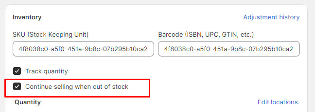
Show preorder badge Select this checkbox to show the preorder badges on the product grids (Note: This preorder shows for the products whose ' Continue selling out of stock' is checked from the admin product side.)
Sold out badge
Show sold out badge Select this checkbox to show the ' Sold out ' badge.
New badge
Show new badge Select this checkbox to show the new badge on the product cards. Period since product creation (days) Adjust the range bar to determine the number of days since the product is created. This selected number is the threshold for displaying the new badge. (Note: The badge is shown automatically based on the product's creation date.)
Custom badge
Show custom badge Select this checkbox to show the custom badges on the product cards. Custom tags list Add custom labels in the product tags and then type those in this field. The custom labels will start showing on the storefront. Use comma separated list for these tags.
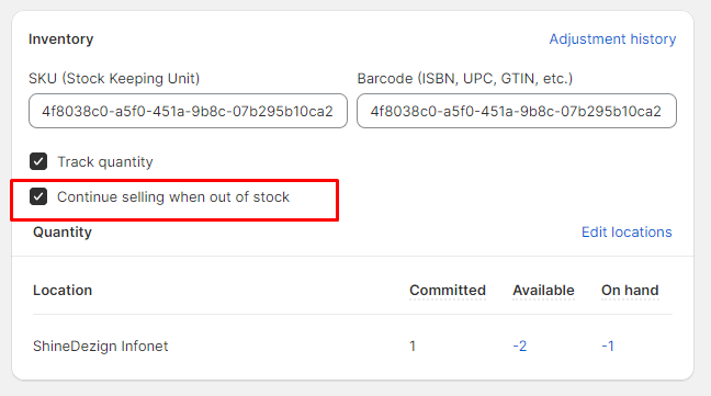
Steps to enable preorder:
This preorder shows for the products whose ' Continue selling out of stock' is checked from the admin product side.

Buttons
Font style
Choose the button's font style from the following options:
- UPPERCASE - lowercase - Capitalize - Unset
Border
Border width
Choose the width from 1 or 2 px.
Cart
Style
Choose the cart style from the following options: - Drawer - Page
Media
Media fit style Choose the media fit from following options: - Cover - Contain
Shipping bar
(Note: This feature only works with a shipping method. If you're using multiple shipping methods, it might show false values to the customer.) Enable shipping bar Select this checkbox to enable/disable the shipping bar on the cart drawer. Minimum shipping price Type any price for providing free shipping to the customers. After reaching this price, the user will be shown a success message.
(Note: Users must write a number, no letters or special characters.) Message Type any relevant message to notify users about the amount saved in this field.
(Note: Use ||amount|| to display the amount within the message.) Success message Enter text to show the success message after the user has reached the minimum shipping price.
Gift wrap
Enable gift wrap Tick this checkbox to show the gift wrap in the cart drawer. Product Select any product to include in the gift wrap. Text Type any text to show with the gift wrapping checkbox.
Drawers
Color scheme
Choose any color scheme for drawers.
Inputs
Corner radius
Adjust the range bar to determine the radius of input field's corners.
Social media
Social accounts
These options are to show the merchant's social networking pages. Facebook Enter the Facebook account link. X (formerly Twitter) Enter the Twitter account link. Instagram Enter the Instagram account link. YouTube Enter the YouTube account link. TikTok Enter the TikTok account link. Snapchat Enter the Snapchat account link. Pinterest Enter the Pinterest account link. Tumblr Enter the Tumblr account link. Vimeo Enter the Vimeo account link.
Search/ Search drawer
Color scheme
Choose color scheme for the search drawer.
Style
Choose the search style from the following options: - Page - Drawer
Search Placeholder Text
Enter the placeholder text of search field.
Search results
Enable predictive search Select this checkbox to enable the predictive search.
Popular searches
Enable popular searches Select this checkbox to enable the popular searches. Heading Enter the heading text. Heading size Select the font size from the following options: - Extra small - Small - Regular - Medium - Large - Extra large - Double Extra large Popular searches Enter the comma separated popular searches text.
Popular categories
Heading Enter the heading text. Heading size Select the font size from the following options: - Extra small - Small - Regular - Medium - Large - Extra large - Double Extra large Categories Choose the collections list from the store.
Recent searches
Enable recent search Select this checkbox to enable the recent searches. Heading Enter the heading text. Heading size Select the heading size from the following options: - XXX- large - XX- large - X- large - Large - Medium - Small - X-small
Product recommendation
Heading Enter the heading text. Heading size Select the heading size from the following options: - XXX- large - XX- large - X- large - Large - Medium - Small - X-small Product list Choose the products list from the store.
Card appearance
Image ratio Choose from image's ratio in the grid from the following options: - Auto - Square - Landscape - Portrait Options visibility Choose options from: - Always - On hover Variants details - Sizes only - Colors only - Sizes & Colors - No variants Sizes visibility Choose the visibility of size options: - Always - On hover On hover: Enable shadow Select this checkbox to show shadow on product card. Always/On hover options Border style Choose style from: - With border - Without border Badges Badges visibility Choose the visibility of badges : - Always - On hover Quick view Display mode Choose the visibility of quick view: - Always - On hover - Disabled Media Media fit style Choose the media fit style from : - Cover - Contain Show second image on hover Select this checkbox to show second image on hover.
Swatches
Note: It applies for the Product card only.
Hide single swatch
Select this checkbox to hide color swatches, if there is only one swatch.
Number of swatches to display
Enter the number of swatches to display.
Type
Choose the type from below options: - Category meta-fields - Variant images.
Swatch
Style Choose the swatch style from: - Circle - Box Size Choose the swatch size from: - Small - Medium - Large
Variants
Size options
Style Choose the swatch style from: - Circle - Box Size Choose the swatch size from: - Small - Medium - Large
Scroll to top
Enable scroll to top
Select this checkbox to enable the scroll to top icon.
Position
Choose the icon position from the following options: - Left - Center - Right
Margin from bottom
Adjust the range bar to determine the vertical position of this icon.
Colors
Background Choose any color for the icon background. Icon Choose any color for the icon.
Favicon
Image: Choose any image for the store library.
Last updated